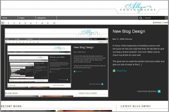
In honor of the beginning of wedding season and because we are just crazy like that, we decided to give our blog a brand spankin’ new look. Make sure to check out all the ins and outs of this beta version.

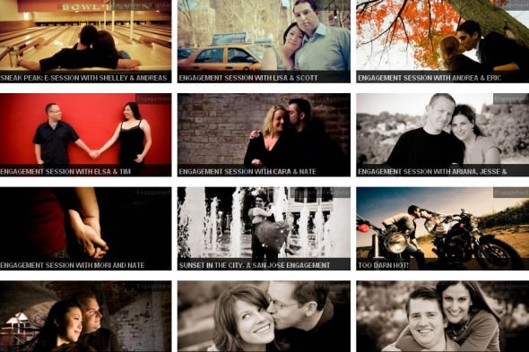
The goal was to make the photos front and center and give you lots of ways to find what you are looking for. The first section allows you to catch a glimpse of our most recent posts. You can slide from the first to the second and so on. It is sort of like the front page of a newspaper. And since you can only see one post’s photo, headline and excerpt at a time in that section, the “Recent Work” section shows you the eight most recent lead photos, along with the most recent story on the right, and headlines from 5 prior posts. If you continue down even further, you will see our categories section. This highlights recent articles in our most viewed categories. At the bottom of the page, you can find a tag cloud amongst other ways to search for what you are looking for.

We hope you enjoy all the new features. Let us know if you have suggestions and ideas that would make the blog even easier to access. We would love to hear how we can make it even better. And most importantly, enjoy!


LOVE the new look guys. Clean, modern and very functional.
Awesome. We have been fussing around with it and are excited to have it going. Still messing with the details. Let us know if you have any suggestions.
Really enjoy this look you two. I was tempted to try a more “magazine” approach to our blog, but found nothing I liked. You guys nailed it!
Hey Jo and Dave, I love it! I think it is a) different, b) intuitive and c) super clean and image focused! Awesome!
Kate